
THE MEMORY AS MOODBOARD
On Using Your Most Cherished Moments as Design Inspiration
by Val White
Every great room begins somewhere.
For some designers it begins with a fabric swatch or a paint chip or a piece of furniture inherited from someone they loved. For others it begins with a feeling — something half-remembered, half-imagined, hovering at the edge of articulation like a word on the tip of the tongue.
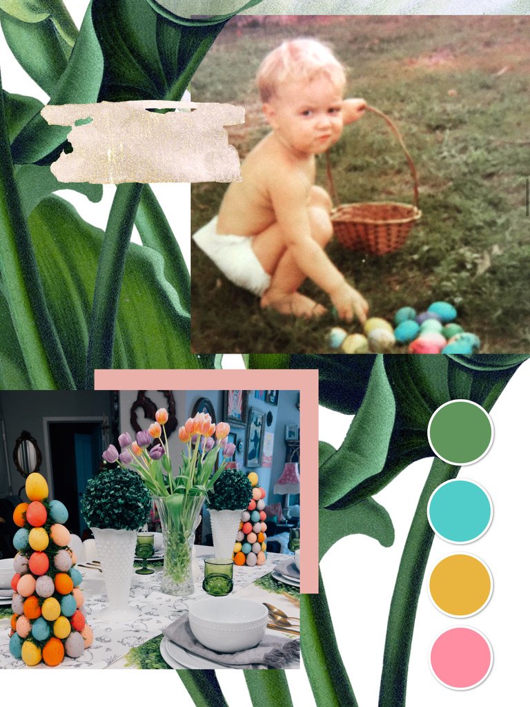
For me, this Easter tablescape began with a photograph.
Specifically, it began with that photograph. The one you see above. A small, sun-warmed, thoroughly unimpressed child — that would be me — sitting in the grass in nothing but a nappy and a look of absolute sovereign concentration, surrounded by the most glorious scatter of brightly colored Easter eggs you've ever seen. No Easter outfit yet. No audience to perform for. Just a boy and his eggs and the particular focused joy of a child who has found exactly what he came for.
I have loved that photograph my entire life. And somewhere along the way, I realized I had been unconsciously designing toward it.
The egg trees came first as an instinct, the way the best design decisions always do — not from a Pinterest board or a trend forecast, but from somewhere older and more personal. I wanted color. I wanted whimsy that didn't sacrifice elegance. I wanted the feeling of an Easter morning in South Florida, the kind I grew up with — abundant, handmade, gloriously unselfconscious — but translated into the language of a table set with intention.
So I built towers of eggs. Topiaries of color — coral and teal and gold and lavender — rising from the table the way joy rises when you stop trying to contain it. Flanked by tulips in that precise shade of spring that exists for approximately three weeks a year and must be seized immediately. Milk glass vessels because they carry the weight of memory without the heaviness of nostalgia. Green goblets because the eye needs somewhere verdant to rest.
The palette you see in the corner of this moodboard — that sage green, that dusty mauve, that warm gold, that unapologetic pink — is not a palette I chose from a color theory exercise. It is the palette of that photograph. Of that grass, those eggs, that particular quality of Florida light on a Sunday morning in April.
The invitation this spring: Pull out an old photograph — one that makes your chest do something. Study it not for the people or the occasion, but for the aesthetic data it contains. The colors. The light. The objects in the background. The feeling it gives you in the body.
That feeling is your design brief.
Build toward it.
